American Meds tampon
and ad, 1967 - American Meds ad, 1941
And read Lynn Peril's series
about these and similar booklets!
See more Kotex items: First ad (1921) -
ad 1928 (Sears and
Roebuck catalog) - Lee
Miller ads (first real person in
amenstrual hygiene ad, 1928) - Marjorie May's Twelfth
Birthday (booklet for girls, 1928,
Australian edition; there are many links here to
Kotex items) - Preparing
for Womanhood (1920s, booklet for girls;
Australian edition) - 1920s booklet in Spanish
showing disposal
method - box
from about 1969 - "Are
you in the know?" ads (Kotex) (1949)(1953)(1964)(booklet, 1956) - See
more ads on the Ads for
Teenagers main page


|

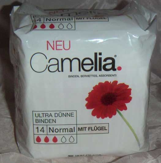
Brilliant packaging for Camelia
menstrual pads, in Germany
Mainstream companies that make
menstrual products usually avoid red like the
plague!
Would you like to see brown on your
toilet paper wrapper?
Dr. Lillian Gilbreth noted as early
as 1927 the frequent use of blue on
pad boxes [read much of her fascinating
report for Johnson &
Johnson], maybe leading the woman's
thoughts to the
sky above rather than to blood below.
Recently, though, some manufacturers
have been coming to terms with
menstruation, as we see with this
Camelia package, below. Actually, the
first Kotex ad campaign, in the early
1920s in America, plastered the Kotex
name on boxcars (here) and
trucks as well as store windows (here), but
this boldness disappeared during the
1920s only to revive with smaller
companies in the 1970s and beyond.
Some people were tired of covering up
the obvious and encouraging women's
shame.
Austrian high-school student Elvira,
from Vienna, who sent me the pictures
(read part of her e-mail, below) wrote
that the red flower looks like a menstrual-blood
stain - bold indeed for a
major company that wants to banish
that thought at any cost! (See
Elvira's menstrual art here, created
after her doctor told her she had a
double uterus, a condition more common
than you think.)
Camelia created the first really
successful disposable pad in Germany
just after Kotex did in America,
although both countries had much
earlier predecessors (Hartmann's
in Germany, and Lister's Towels, from
Johnson & Johnson, in America,
both from the 1890s).
Germans call the camellia Kamelie,
so the company name is a hybrid -
assuming they intended it to mean the
flower. That seems obvious.
Manufacturers have long used flowers
with menstrual products. "Flowers"
itself is an ancient English term for
menstruation, although it means
"flowing," not the beauties in your
garden; read a discussion
about this. But one male writer likens
the menstrual odor to marigolds,
and I think the botanical flowers help
women feel good things when she muses
about that time of the month - flowers
are "feminine," but a dainty
femininity, not like menstruation!
It's the opposite of what people
usually think it. Menstrual cups are
themselves tulip shaped, and an early
seller exploited that (see here) rather
than show the cup itself.
Look how far the company has come
since this early Camelia ad
from the 1920s, with Nurse Thekla
wagging her finger at you! Women found
a slip of paper in the box that they
could give to a female clerk instead
of speaking to her; the slip asked the
clerk to sell her a box of Camelia!
And Modess pads used the gimmick at
the same time in America with its
"silent purchase" coupon (see it here), women
clipping the coupon out of a magazine
ad.
Customers often see New - here, NEU
- on menstrual product packaging and I
wonder if it relates to the inability
of pads and tampons to satisfy many
women, since periods are often
unpredictable. Dissatisfied, she sees
an allegedly new pad in the
supermarket: "Maybe this new one will
work," she says to herself, and buys
it.
Hm, the company stole the red dot
from the American Kotex magazine
campaign! But not if Kotex owns
Camelia, which it does! So two early
menstrual pad companies are now one,
as is their advertising. Women in
Germany also use period (Periode) to
refer to periods, but say Punkt to
mean the dot at the end of a sentence
(look at the bottom picture on this
page). I don't know if that part of
the campaign translates.
Thank you, Elvira, for
sending the pictures and your
comments! Here's part of her e-mail
(my translation follows):
Lieber Harry,
Ich war sehr überrascht als ich die
Farbe ROT in dem Regal mit
Damenhygiene auffand, vor allem in
so einer Kombination mit weiß, da
die Blume eindeutig wie ein "Fleck"
wirkt, wie Sie auf dem Bild erkennen
können.
Auch die verpackung der Binde
selber und der "Streifen" auf der
Rückseite der Binde weist rote
Konturen von Alltagsgegenständen auf
(z.B. Lippenstift, Handtasche
e.t.c.) , welche auch wie rot
gefärbte Flecken wirken. Ich habe
einige Bilder von diesem Produkt
gemacht denn ich fand die Verpackung
wirklich einzigartig wenn man sie
mit anderen Damenhygieneprodukten
vergleicht welche meist türkis oder
blau verpackt sind (z.b. "Always").
Dear Harry,
I was very surprised to find the
color RED on the [store's] shelf of
feminine hygiene products, and above
all in combination with white,
because the flower unequivocally
acts as a "stain," as you can see in
the picture.
The packaging of the pad itself and
the strips on the back of the pad
have red outlines of everyday things
(lipstick, hand bag, etc., that also
appear to be red stains. I've made
some pictures of the product because
I found packaging truly unique when
compared with other feminine hygiene
products, which mostly have
turquoise or blue packaging (for
example, Always).
|
|

|
| |
|

|
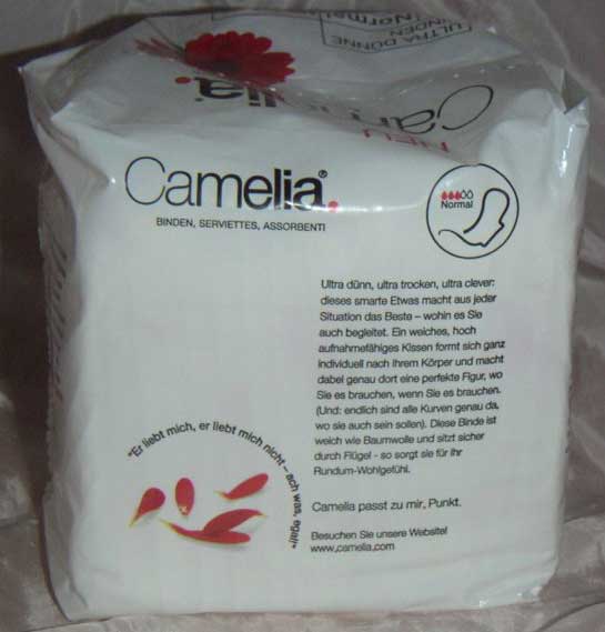
Lower picture:
At lower left you see in German, above
the blood-drop leaves, "He loves, he
loves me not - aw, so what!"
The drop-leaves repeat on the
indications of pad absorbency, the red
and hollow drops, at upper right and
in the top photo.
"Camelia passt zu mir, Punkt," at
bottom right, means "Camelia fits me,
period." But Punkt doesn't convey the
message Periode would - but that's
impossible in German.
|
|
© 2003 Harry Finley. It
is illegal to reproduce or distribute
any of the work on this Web site in
any manner or medium without written
permission of the author. Please
report suspected violations to hfinley@mum.org
|
|


